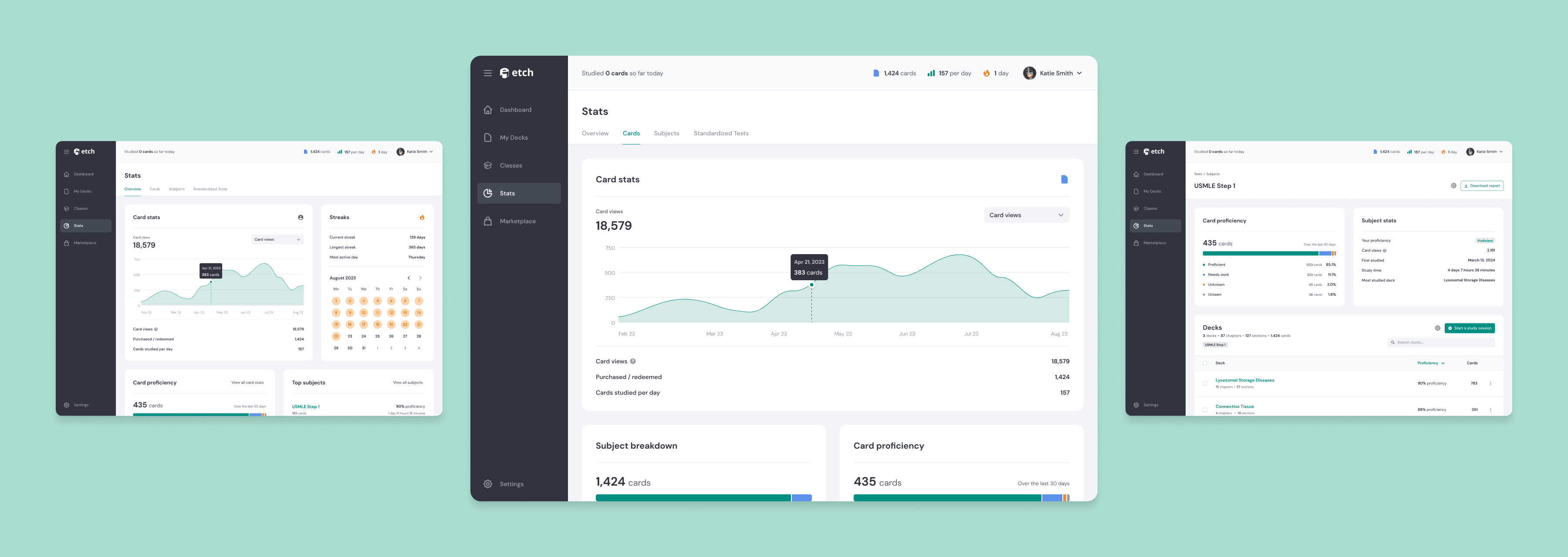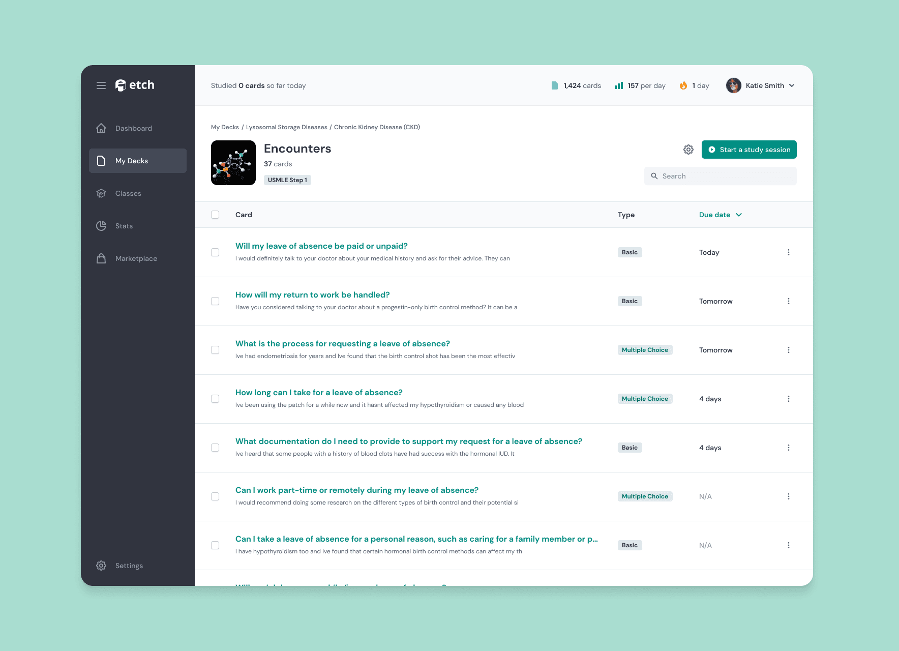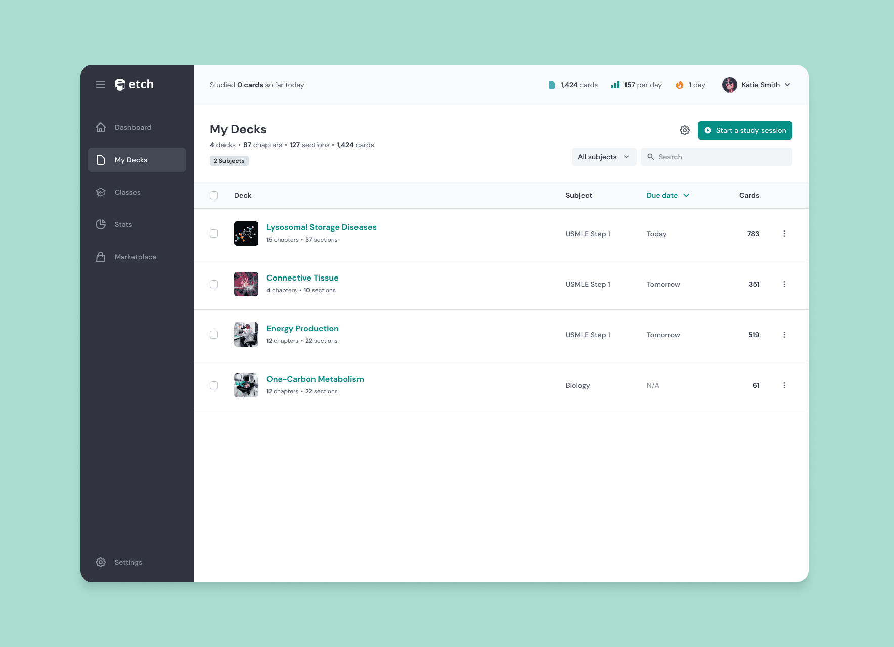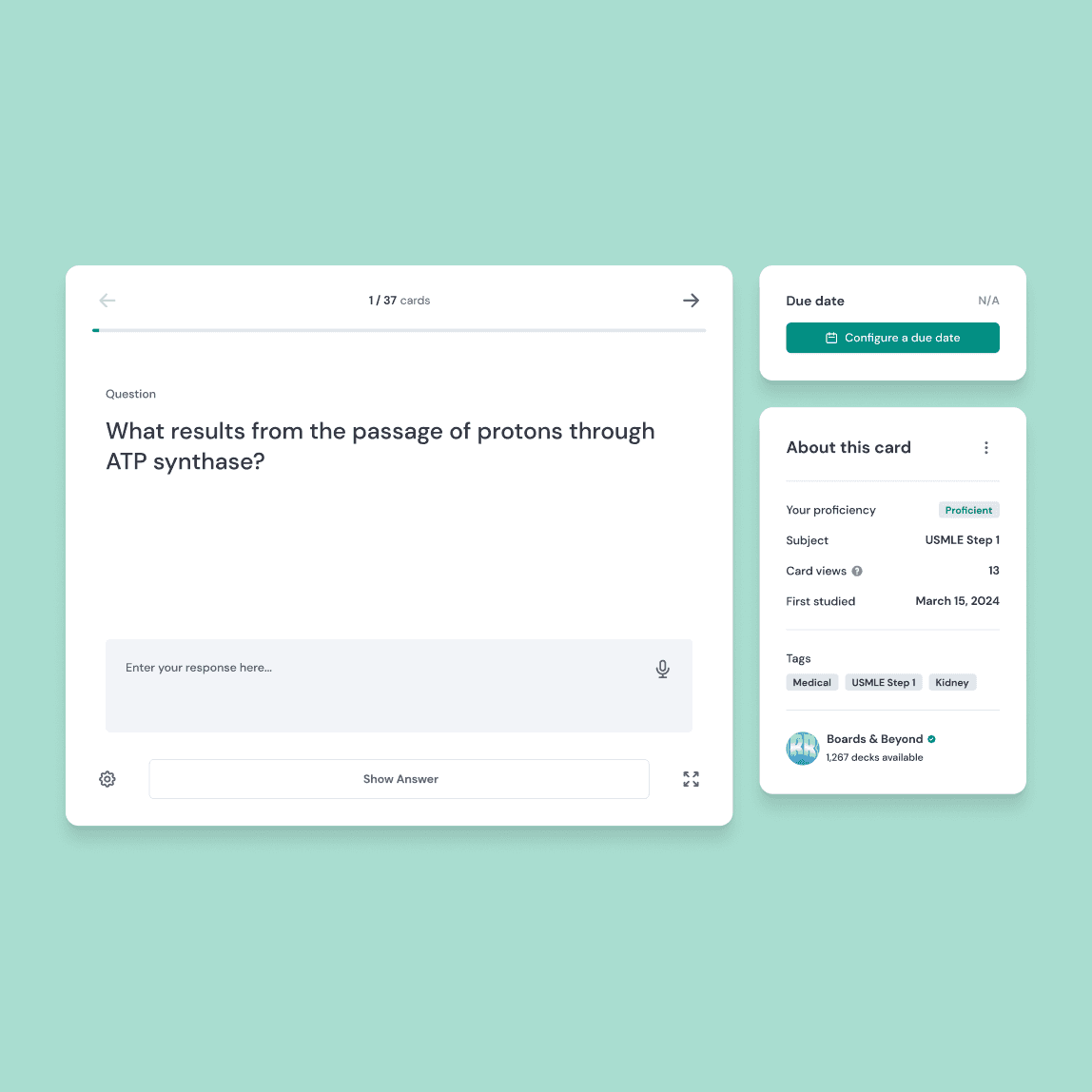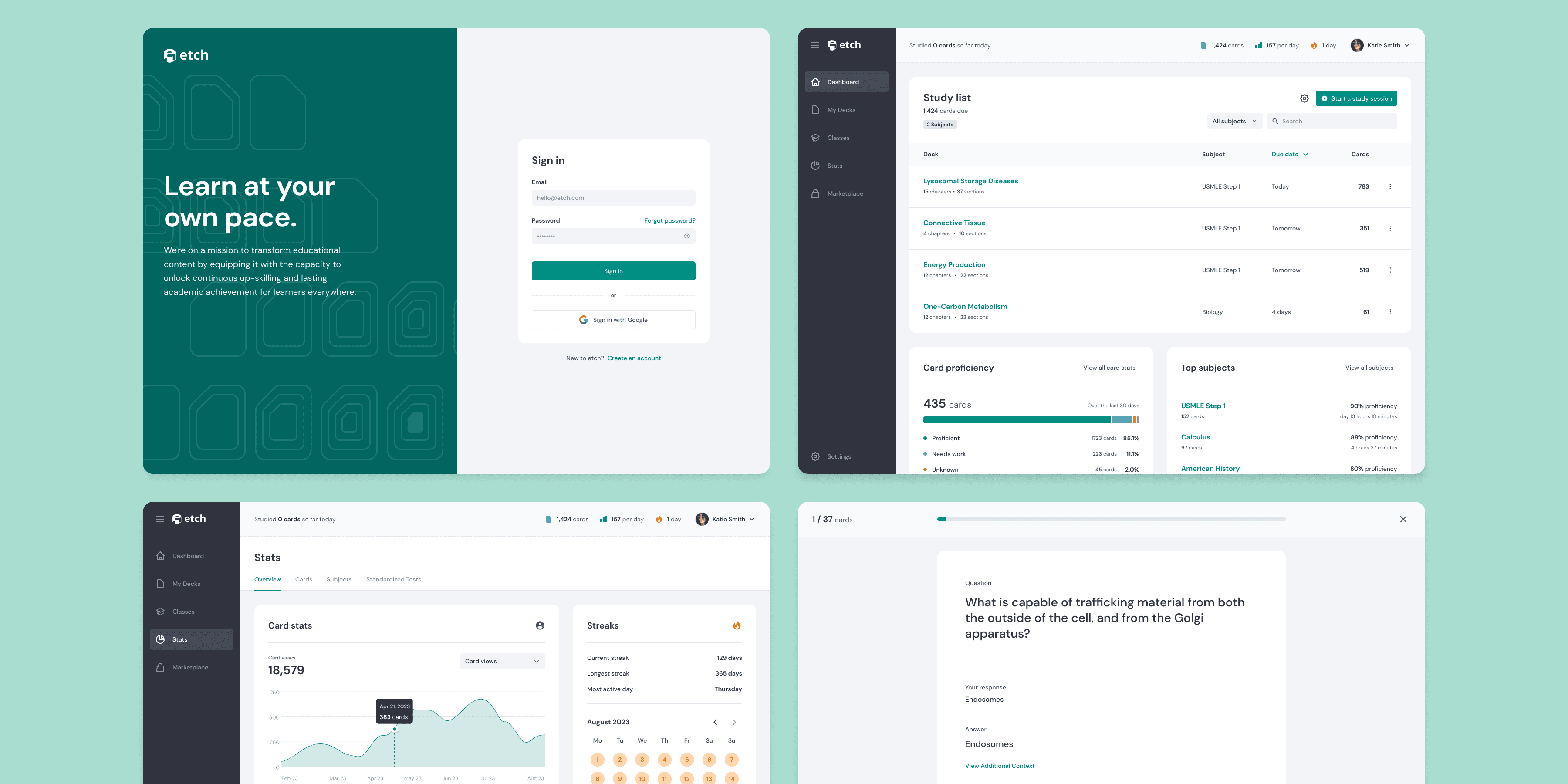
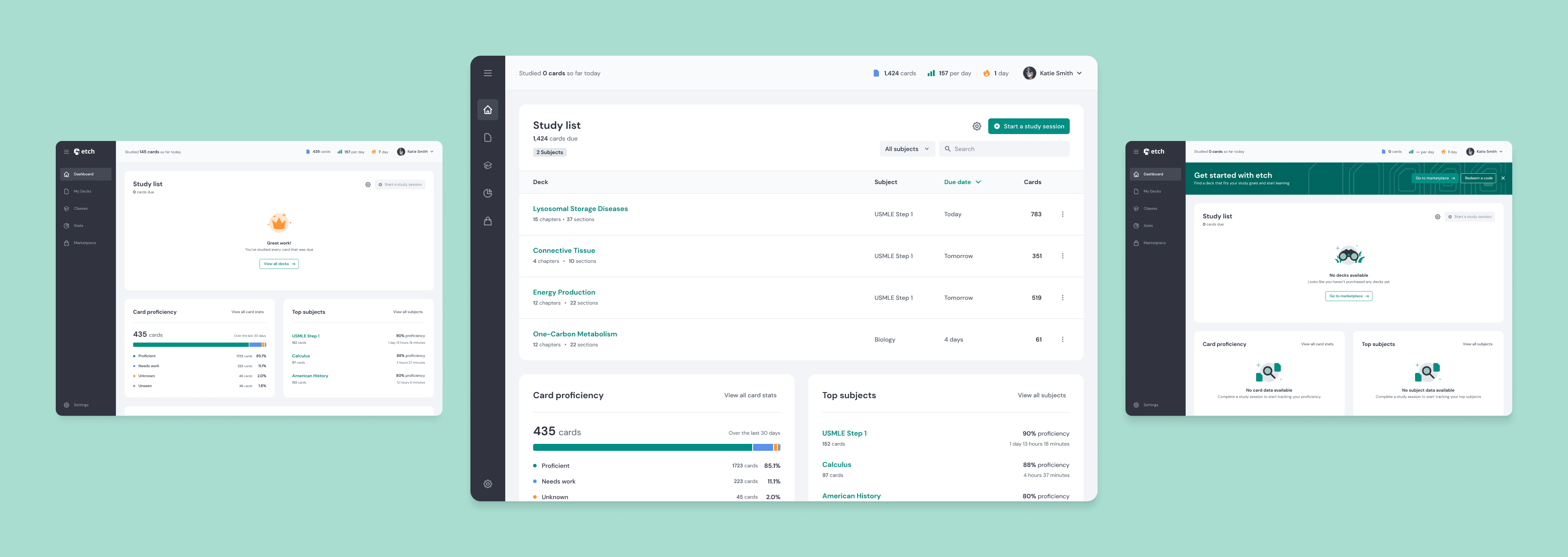
The Etch dashboard gives easy access to jump into a study session and view your stats.
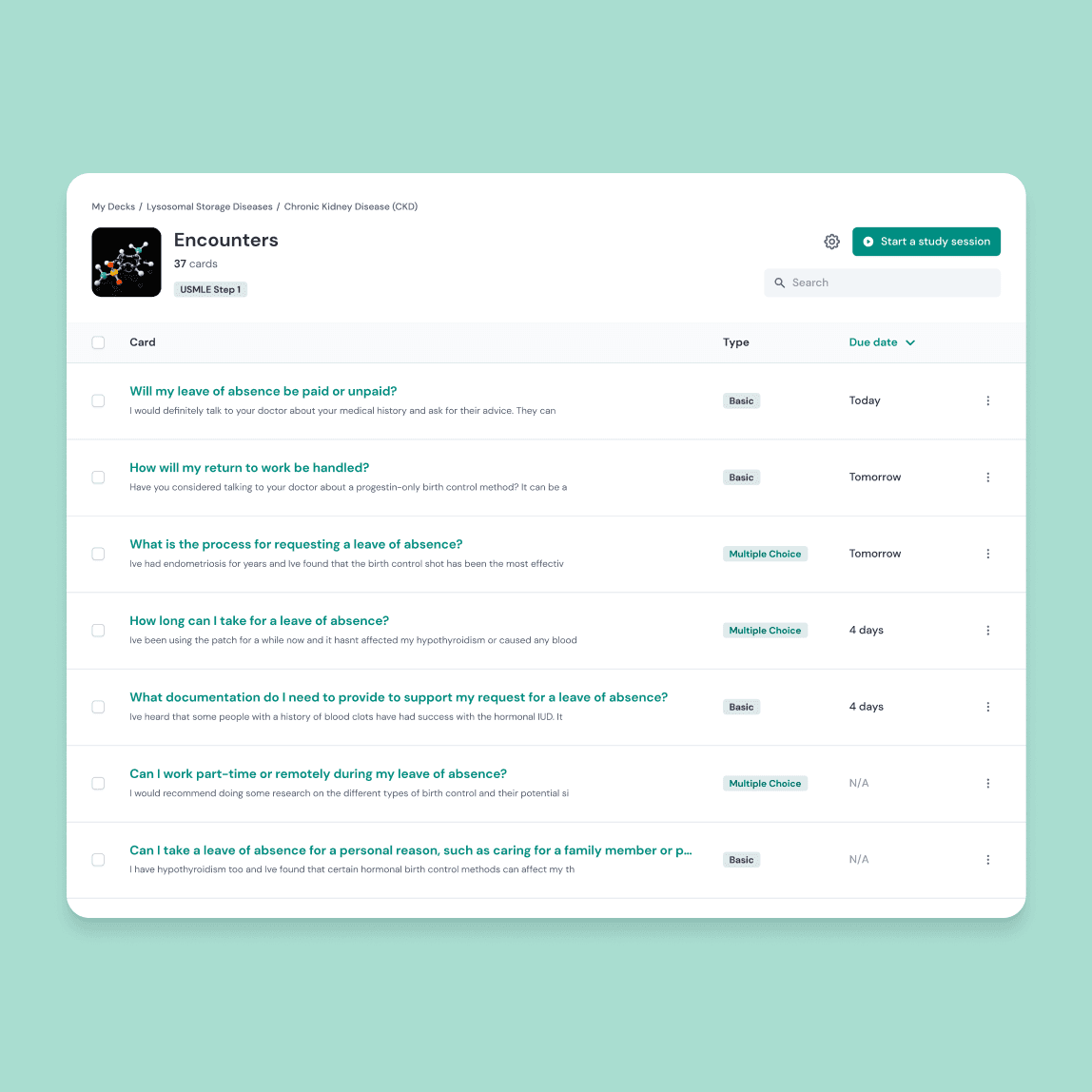
When the Etch founder came to me, there was only a logo and the pitch for what the app was supposed to do. The entire design project was from the the ground floor to establish the look and feel as well as design every interaction from sign-up to the flash card learning loop.
That meant building out a design system, figuring out the tone of voice, and putting each part into practice for every screen and interaction. I could go in depth to each individual section, but I'll be focusing mainly on the onboarding experience to get a taste of the design work that has gone into this project.
Onboarding
One of the biggest issues with getting new users invested in the platform was a lack of any onboarding experience to guide them through the basics and build their confidence in using Etch.
During the initial beta, the app was dropping new users directly into the dashboard, leaving them to fend for themselves and as a result was causing a ton of users to bounce after their first login.
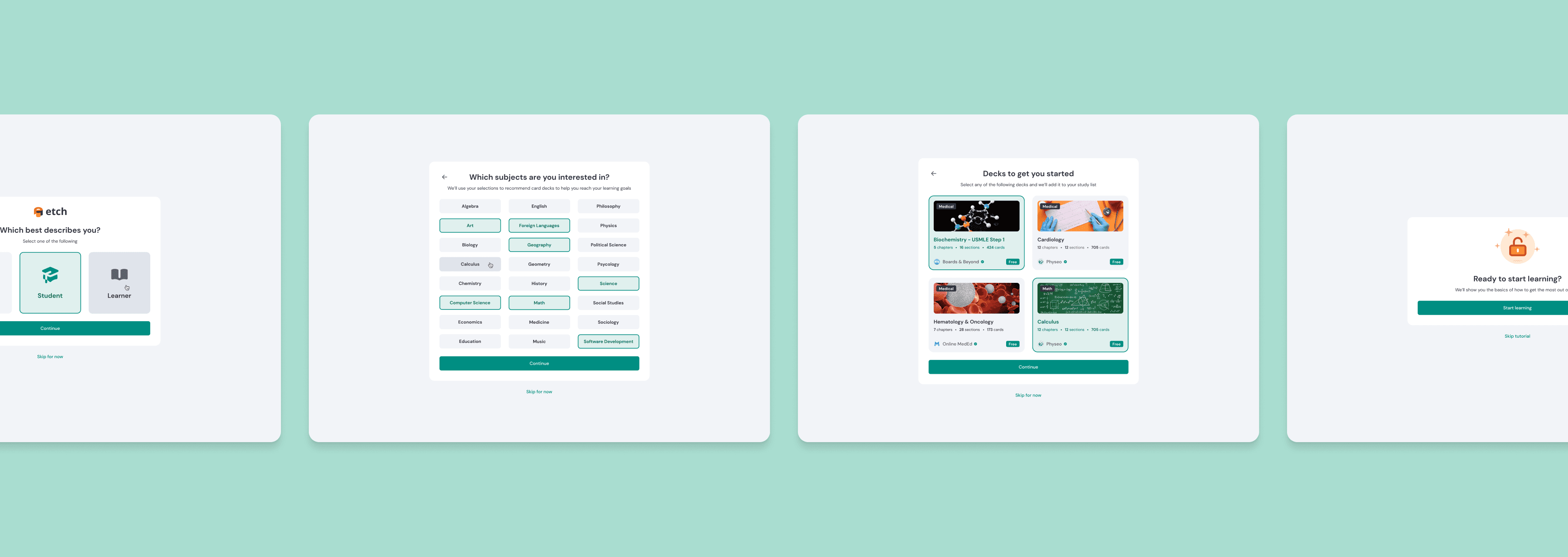
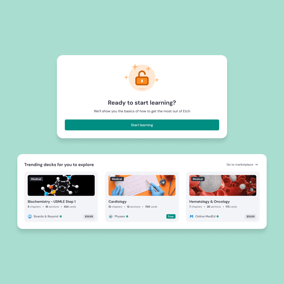
Etch's initial onboarding to learn more about the user and to choose starter card decks to get them going.
The onboarding workflow was broken up into three parts: getting to know the user, teaching users how to use the flash card interface, and then giving an overview of the platform's features.
I designed each section to be bite sized as to not overwhelm a user and made sure each screen was skippable for users that didn't want to take the time to go through each step.
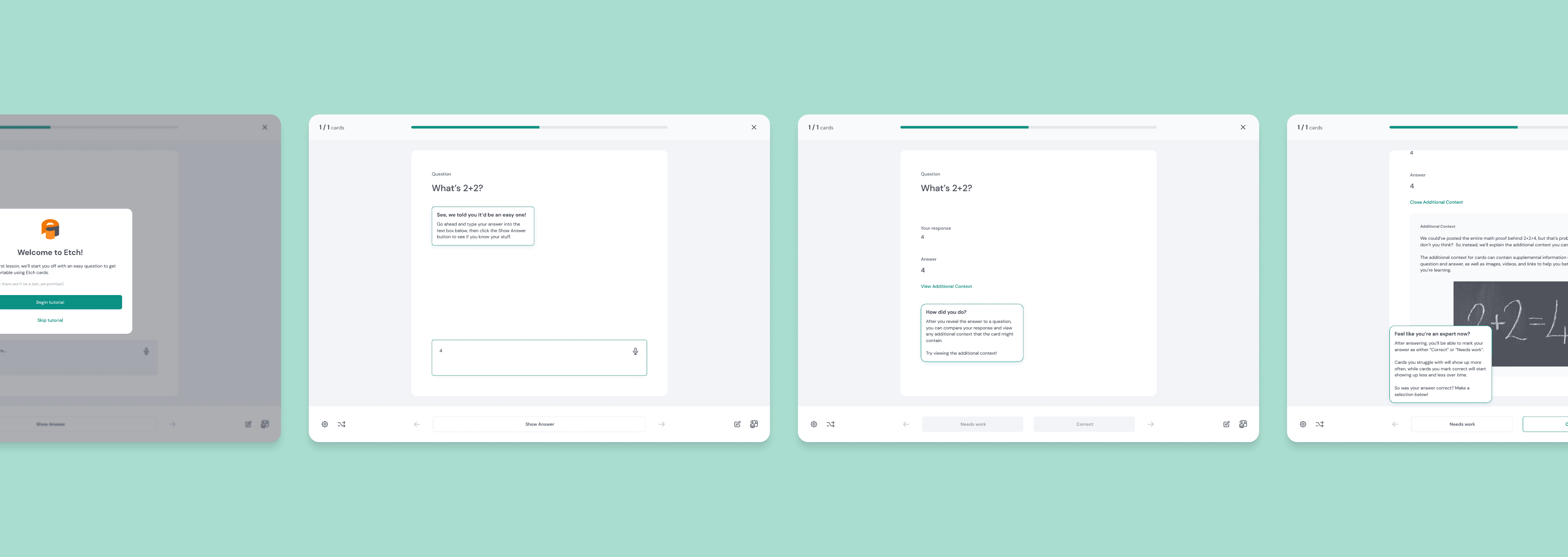
Teaching users how the flash card interface works.
The second section focused on teaching the user how to interact with the heart of Etch, the flash card interface. This experience needed to quickly get users comfortable with using flash cards, without being boring or diving too deep into every little feature.
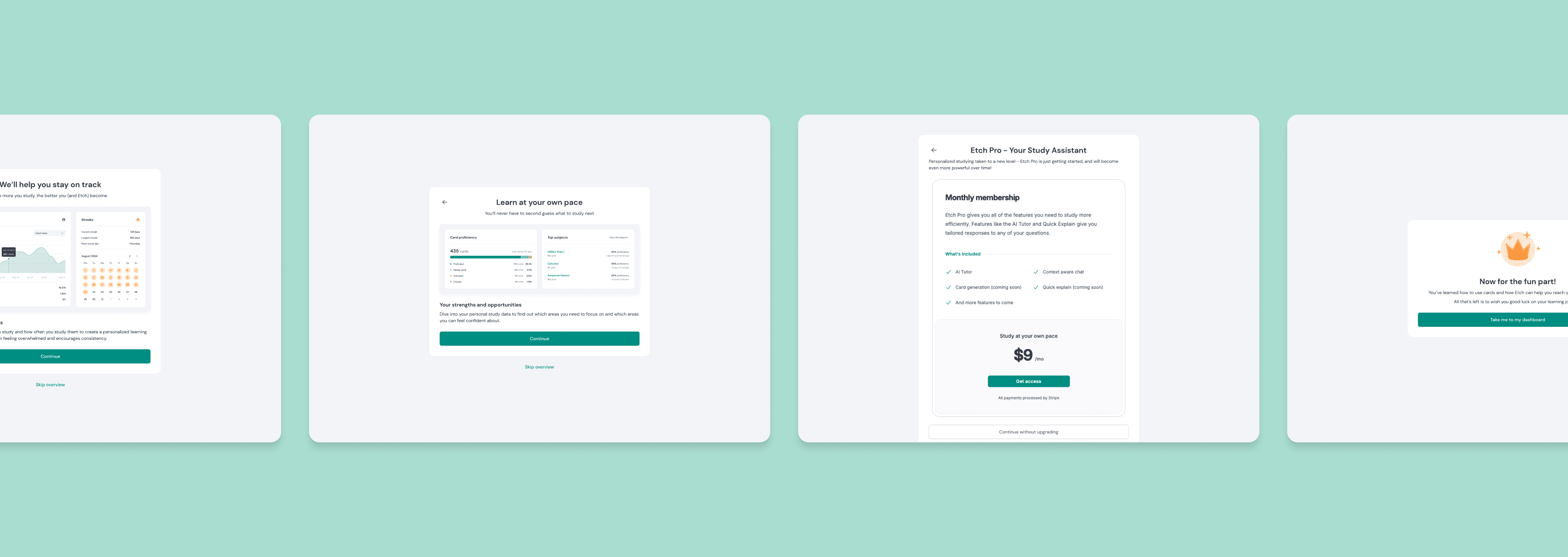
Final section that gives context to other Etch features and upsells the pro membership before the user is dropped into the dashboard.
After implementing this change during the beta, Etch experienced 53% more users returning after sign-up than before. And they saw that users that went through the flow were 36% more likely to purchase a new deck than users that signed up before the onboarding flow was implemented.
Outcome
In addition to the great success that the onboarding workflow had during the beta, the designs as a whole were used to secure investor funding, ink deals with major educational material publishing companies and drive growth to the user base that continues to use the platform.
Feel free to check the company out at etchlearn.com! Or click around the prototype in Figma to get a feel for the app!
